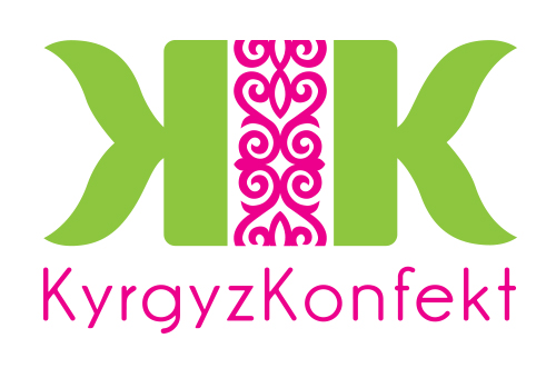
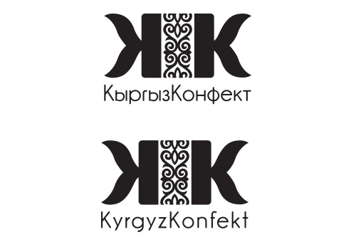
Kyrgyz Konfekt Logo
Aiming for their cognac-soaked, chocolate-covered, dried apricots to become Kyrgystan’s new national treat, Kyrgyz Konfekt needed a logo that looked the part. We were also happy to do some product testing along the way – free of charge.
The Assignment:
To create a simple logo which could be used on packaging, and the web with potential to grow into other areas in the future.
Challenges:
-
Multiple languages/alphabets – the logo had to work both with the Roman and Cyrillic alphabet
-
Relating to the product – the logo needed be recognisable as something relating to candy
-
Local – the logo needed to allude to the company’s Central Asian origin
Solution:
Using the companies initials “KK” we created a candy shape with a typical Central Asian pattern printed in the center of the “wrapper”. With one- and two-colour versions, the logo colour could easily be modified to match any kind of background and its compact shape it is easy to use and is easily recognisable in any size.
Kyrgyz Konfekt Projects:
No Results Found
The page you requested could not be found. Try refining your search, or use the navigation above to locate the post.
Branding & Identity Projects: