
Quasar
The Assignment:
The Kyrgyz Republic’s largest and most influential advertising agency approached us about helping them rebrand in summer 2015. Although established in the region as experts who always deliver results, it was felt that their identity didn’t reflect their expertise or their customer-centred approach.
Challanges:
Keeping it simple, yet unique – being a popular company name there are many existing logos using the “Quasar” concept and name. The challenge was to create something new and interesting, while communicating the companies expertise and values, and of course, keeping the mark simple.
Solution:
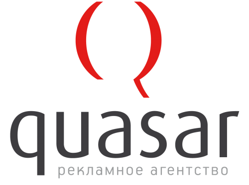
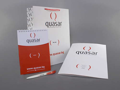
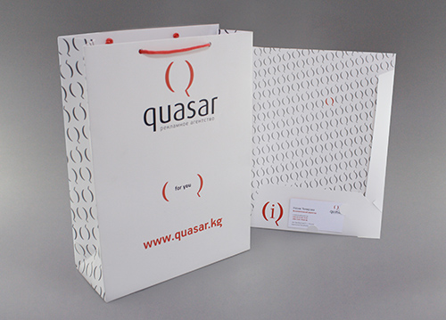
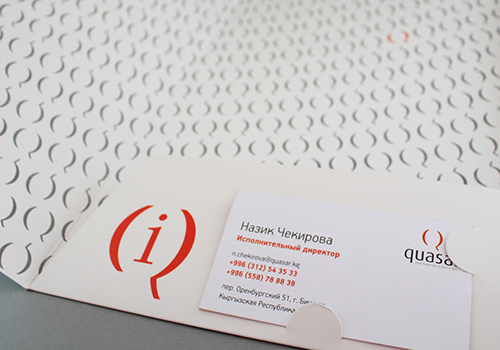
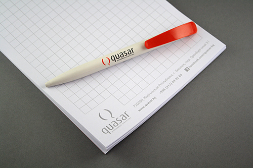
After extensive research and consultation, we developed a mark that is sophisticated, simple, and centred around the concept of communication. The ‘Q’ of Quasar forms a speech bubble. The ‘brackets’ used to the create the ‘Q’ are also used in communication materials to hold key information about the company or the project.
Quasar – a company that speaks to people, and helps their clients speak to them.
Branding & Identity Projects:

Promotion Projects:
No Results Found
The page you requested could not be found. Try refining your search, or use the navigation above to locate the post.