
Toi Master Popcorn
The Assignment:
We were approached to help an established confectionery company launch a new ready-to-eat popcorn concept in the Kyrgyz Republic.
Challanges:
The design needed to be able to stand out in a competitive category and be flexible to accommodate new flavours as they were launched.
The Solution:
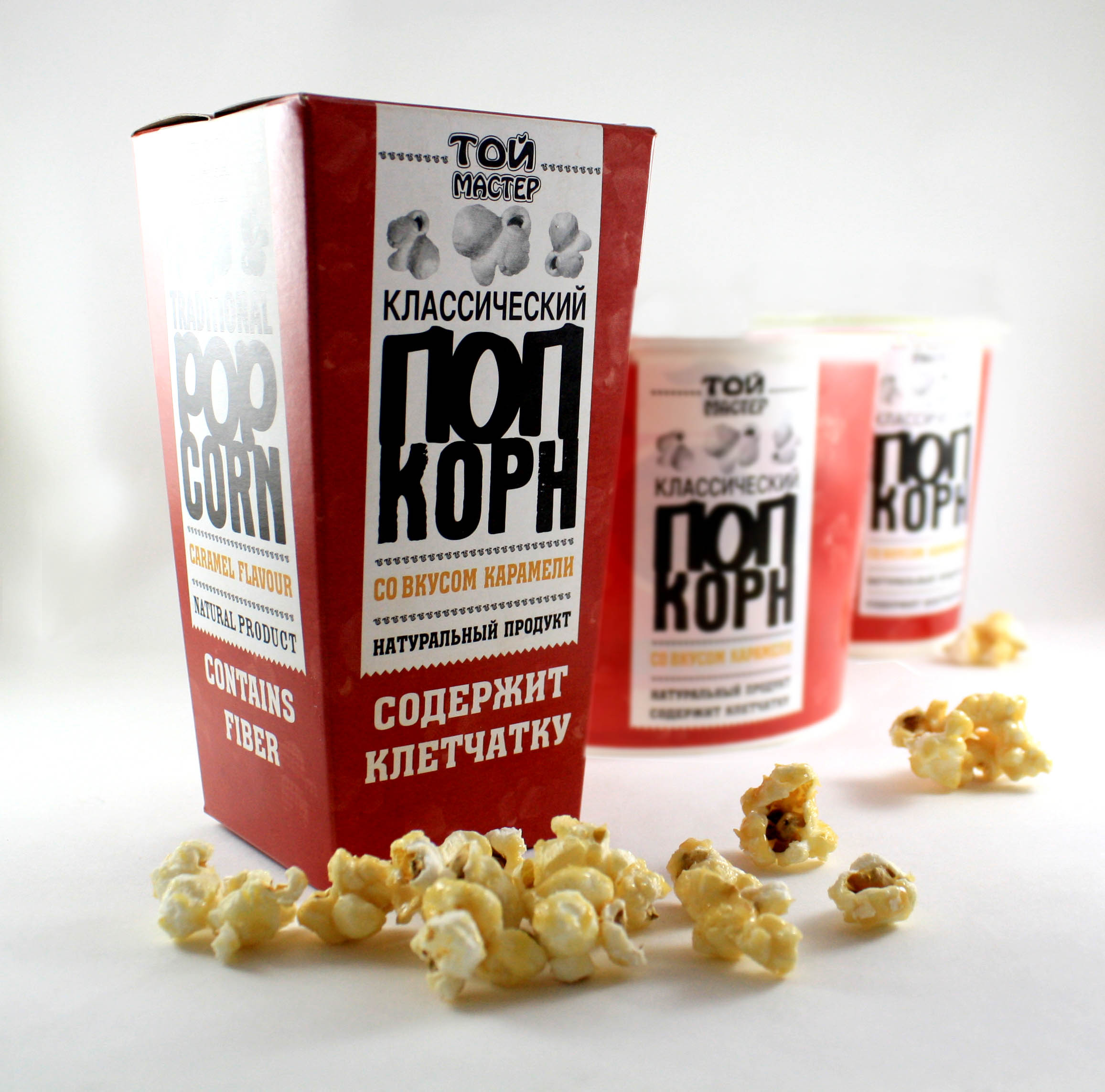
We combined a number of fonts to create a retro-American/ ‘all the fun of the fair’ feel to the packs. A strong primary colour palette was chosen with a subtle pattern of popcorn in retro newsprint style, to create bold blocks of colour when merchandised together.


