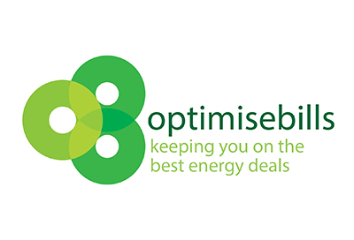
Optimise Bills Branding
The Assignment:
OptimiseBills is a UK-based company helping people reduce their energy bills. The energy sector is increasingly competitive and tariffs change regularly. OptimiseBills works for its customers to track the best time to change tariffs in order to save money.
The ‘O’ and ‘B’ joining together to create shapes that echo cables/pipes, reflecting the industry it sits within. Green was used to differentiate them in a sector dominated by blues/reds/oranges.
Challenges:
-
Numerous competitors in different sectors – Utility suppliers are typically blue/orange in the UK. Money-saving companies are also predominantly blue/orange and feature piggybanks prominently!
Optimise Bills Projects:

Branding & Identity Projects: