
Sierra Coffee Logo
Back in 2010 coffee and café culture was a relatively new phenomenon in Central Asia. Enter Sierra Coffee, a company with a vision to bring great coffee and a relaxed laid-back atmosphere to the region.
Typically, logos in the region do what they say on the tin – a building company includes a house somewhere, and cafés usually feature a coffee bean. Sierra wanted to create something new, vibrant and unique – and a little bit ambiguous!
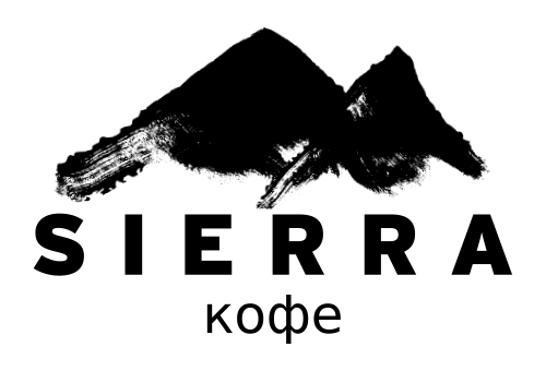
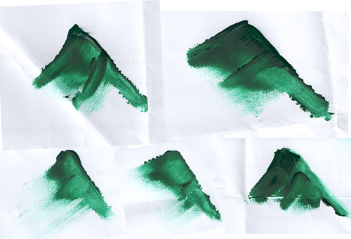
Sierra means ‘jagged mountain range’ and with the region surrounded by mountains, it seemed silly not to depict mountains. The mountains are actually finger-painted; hinting at the hand-made care with which Sierra roasts and serves its coffee.
Four years on and the Sierra mountains are one of the most recognised brands in the country. Spark is proud to have been a small part of this success.
Challenges:
-
A new brand in an emerging market – Existing coffee brands were old-fashioned, however people recognised them. Would customers embrace or avoid something new? Educating customers about coffee was part of building the brand and the bold logo was instantly visible wherever this took place.
-
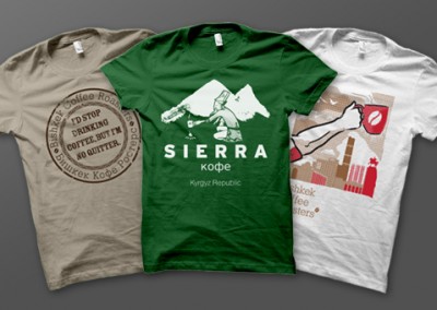
Production restrictions – as a start-up the solutions needed to be easily and affordably replicated. In addition there were limits in size/colour and quality across a range of products so the logo had to come through these still looking and feeling great..
-
Cultural differences – the mark needed to resonate with both locals and ex-pats.
Branding & Identity Projects:


